How Catalog Paper Choice Affects Color Appearance
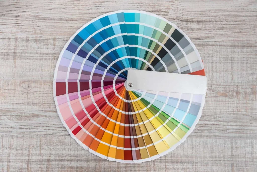
In a luxury catalog, color is part of the product. It communicates quality, sets mood and makes materials look realistic. Yet the same content can look noticeably different across paper stocks. Paper is not a passive background; its shade, surface and absorbency change how ink sits on the sheet and how light reflects back to […]
Color Correct: Why and How to Achieve Accurate Color Representation in Print
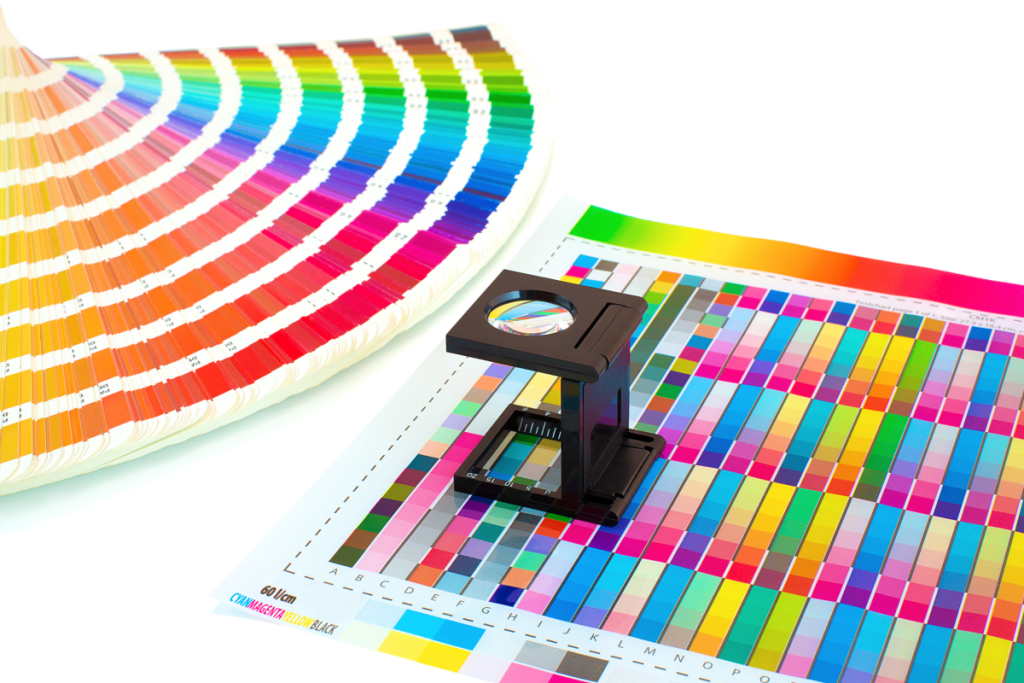
Your brand relies on accurate print color. According to Idealliance, “Color consistency reinforces trust. Inconsistency with colors associated with a brand subconsciously diminishes it, and erodes brand loyalty.” You also want the images in your publication to stay true to the artist’s vision and/or accurately show what’s being pictured. But how can you achieve consistent, […]