In a luxury catalog, color is part of the product. It communicates quality, sets mood and makes materials look realistic. Yet the same content can look noticeably different across paper stocks. Paper is not a passive background; its shade, surface and absorbency change how ink sits on the sheet and how light reflects back to the eye.
If you want your catalog to feel premium and consistent, paper selection should happen alongside photography, retouching and color targets, not after the design is finished. Here’s how paper choice influences color appearance and how to steer those effects intentionally.
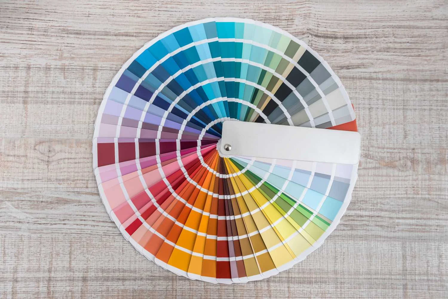
Why Paper Is the Fifth Color
Process Inks are translucent layers. The paper underneath becomes the “white” in every highlight and the reference point for every neutral. You can increase ink coverage, but you cannot print a whiter white than the sheet itself.
Think of paper as a built-in color cast. A warm sheet nudges images warmer. A cool sheet makes the same images feel cleaner and more contemporary. Once you pick a direction, everything from product photography to skin tones will follow it.
Paper White: Shade, Whiteness and Brightness
White papers are not identical. Two stocks can both be described as “bright,” yet look different side by side. What matters for appearance is the paper’s white point: does it read warm, neutral or cool?
Warm whites tend to soften contrast and make reds, browns and skin tones feel richer. Cool whites can make blues, grays and clean neutrals look sharper, but they can also make warm products feel slightly cooler than expected.
Many premium grades also use optical brightening agents, often called OBAs, to appear whiter. OBAs react to ultraviolet energy in the light source, so the same sheet can look different under daylight versus indoor lighting. For color-critical work, evaluate paper and proofs under consistent lighting so decisions are repeatable.
Coated Versus Uncoated: Ink Holdout and Detail
The biggest visual shift comes from the surface.
Coated papers have a sealed, smoother surface that keeps ink closer to the top of the sheet. Better ink holdout usually means higher apparent saturation, deeper blacks and crisper detail in photos, fine type and thin rules. For product-heavy catalogs, coated text is often the most predictable path to clean gradients and strong contrast.
Uncoated papers are more porous. Ink penetrates the fibers, which increases dot gain and reduces edge definition. The trade-off is a softer, warmer look with a tactile feel that many luxury brands intentionally seek. Just expect solids to look less rich and very fine detail to soften compared to coated.
Some premium catalogs even mix stocks, using coated signatures for product spreads and uncoated sections for storytelling, letters from the founder or brand journalism. When you do, plan transitions carefully so shifts in white point and contrast feel intentional.
Finish Matters: Gloss, Silk and Matte
“Coated” does not automatically mean glossy. A coated sheet can be gloss, silk or matte, and each changes perceived color even when the ink is the same.
Gloss finishes tend to increase perceived contrast and make colors feel more saturated. The downside is glare, which can wash out imagery at certain angles. Silk and matte finishes scatter light more evenly. They reduce glare and fingerprints and can feel more upscale in-hand, but they can slightly lower perceived “pop” in deep shadows.
Finishing coatings and laminations can amplify these effects. Aqueous or UV coatings can add depth and scuff resistance, while soft-touch films can mute reflections and shift how dark colors read. Evaluate samples with the same finishing plan you intend to use.
Opacity and Show-Through: The Hidden Color Killer
Even if the front side looks great, low opacity can undermine color. When images or solids show through from the reverse side, highlights look dirtier and neutrals lose clarity.
Opacity becomes especially important in catalogs with heavy coverage on both sides of a spread or lots of rich black backgrounds. Choosing a stock with higher opacity or slightly more basis weight can keep color looking clean without redesigning layouts.
Proofing and Pre-Press: Make the Paper Part of the Plan
Paper selection is most successful when it is tied into color management early. Your monitor, proofing system and press condition need to agree on what “neutral” looks like on the chosen sheet.
A few best practices help reduce surprises:
- Separate using the correct ICC profile for your intended paper type so dot gain and ink limits are accounted for.
- Soft proof with paper white simulation when available so highlights and neutrals are judged against the real sheet white.
- Review a contract proof under consistent lighting, and for critical colors, print test forms that include solids and tints.
In pre-press, slight curve and gray balance adjustments can optimize imagery for coated versus uncoated looks. If the stock changes late, those corrections often need to be revisited, so lock paper early whenever possible.
How to Choose Paper for a Luxury Catalog
Design with intention to stay true to your brand, then match paper to the content. If your catalog relies on high-resolution product photography, metallic detail or fine typography, a coated sheet with a controlled gloss level usually delivers the clearest color and the strongest contrast. If your brand leans heritage, natural materials or an editorial voice, a premium uncoated stock or a matte-coated sheet can deliver a more tactile, curated experience.
Whatever direction you choose, compare printed samples on different papers using your real images, not generic swatches. That is the fastest way to see how blacks, skin tones and signature brand colors will land.
If you’d like help choosing options that support luxury color reproduction, Walsworth offers the expertise to guide you through paper, proofing and pre-press decisions so your catalog looks as good as it possibly can. Ready to learn more? Get in touch with us today.
* This article was developed with assistance from OpenAI’s GPT 5.2 Pro Deep Research large language AI model.