In an age when readers are surrounded by digital content, a printed local magazine still has something powerful working in its favor: physical presence. A well-crafted city or regional publication can become more than something people read once and recycle. It can earn a place on a coffee table, in a waiting room or on a bookshelf for months after publication.
The magazines that achieve this level of staying power rarely do so by accident. They combine strong editorial content with thoughtful design and premium production choices that encourage readers to pick them up, flip through the pages and keep them on display. For publishers of local and regional magazines, every design and printing decision plays a role in creating that experience.
Make Photography the Hero
Photography is often the biggest differentiator between a local magazine and other forms of media. Readers want to see the places, businesses, events and people that make their communities unique.
To maximize visual impact, prioritize large, high-quality images throughout the publication. Feature opening spreads, full-page photography and generous white space allow images to tell a story without feeling crowded.
Image quality is equally important. Even the best design cannot compensate for low-resolution photography. Establish clear standards for contributors and photographers so every image reproduced in print is sharp, properly color corrected and prepared for production.
When readers encounter vibrant photography that feels immersive and authentic, they are more likely to continue turning pages and keep the issue around after reading it.
Invest in a Strong Cover
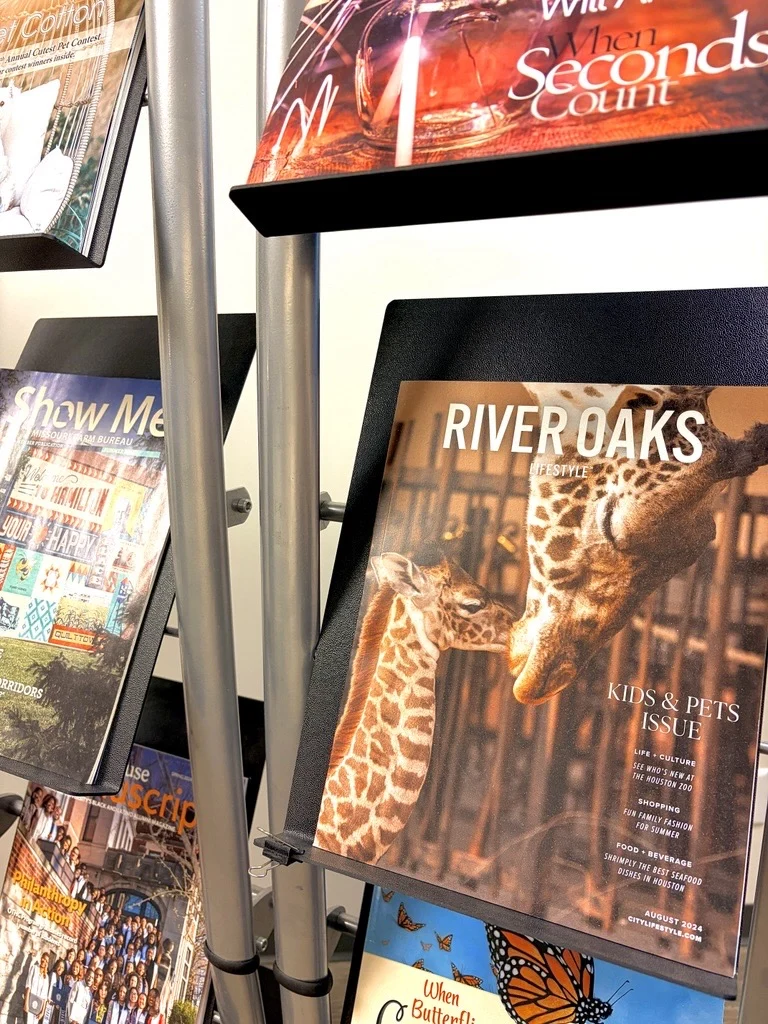
The cover is the magazine’s most important marketing tool. Whether the magazine sits in a rack, a lobby or on a coffee table, the cover determines whether someone picks it up.
Successful local magazine covers often rely on a single compelling image paired with clean, readable typography. Resist the temptation to overcrowd the cover with too many headlines, graphics or promotional elements.
A strong cover should communicate quality immediately. Readers should understand the publication’s personality at a glance. Is it sophisticated? Community focused? Lifestyle oriented? Arts driven? The visual choices on the cover should reinforce that identity issue after issue.
Choose Paper That Enhances Photography
Paper selection can dramatically influence how readers perceive a publication. For magazines that rely heavily on photography, coated stocks can provide the color vibrancy and image sharpness needed to showcase visual content effectively.
Gloss and matte finishes each offer distinct advantages. Gloss papers can create rich color saturation and striking contrast, making photography appear more vivid. Matte and silk finishes often provide a more refined feel while reducing glare and improving readability.
Many premium local publications use heavier-weight cover stocks and substantial text papers to create a more luxurious experience, both visually and tactilely. The additional heft communicates quality before a reader even opens the magazine.
Paper should support both the visual goals and audience expectations of the publication. The right stock becomes part of the overall brand experience, and contributes massively to the magazine’s overall look and feel.
Use Specialty Finishes Strategically
Some of the most memorable magazines engage multiple senses, including touch. Specialty finishing techniques can help draw attention to key visual elements while increasing perceived value. However, these effects work best when used selectively.
Spot UV coating can create contrast between glossy and matte surfaces. Soft-touch coatings can provide an upscale tactile experience. Foil accents can introduce visual highlights that help certain design elements stand out.
The goal is not to use every available enhancement. Instead, choose one or two effects that reinforce the publication’s brand and elevate the cover or special sections without overwhelming the design.
When executed thoughtfully, these details can turn an ordinary issue into something readers want to pick up and display.
Prioritize Clean, Intentional Layouts
An easy mistake to make in local publishing is trying to fit too much information onto every page.
Photo-heavy magazines generally benefit from spacious layouts that allow content to breathe. Readers should be able to move comfortably through stories without feeling overwhelmed by competing visual elements.
Use consistent grid systems, balanced typography and clear hierarchy to guide readers through each article. Headlines, subheads, pull quotes and captions should work together to create an organized reading experience.
White space is not wasted space. It improves readability, emphasizes photography and contributes to a polished appearance. Magazines that feel thoughtfully designed often appear more premium, even when working within modest page counts and budgets.
Create Sections Readers Can Revisit
Display-worthy magazines often contain content that remains valuable beyond publication day.
Consider including evergreen elements such as local travel features, restaurant guides, arts coverage, historical stories or community profiles. Readers are more likely to retain issues that contain information worth revisiting.
Design can support this goal as well. Make recurring departments visually distinct and easy to locate. Consistent section openers and navigation elements help readers use the magazine as a reference resource rather than a one-time read. The longer a magazine remains useful, the more time it spends visible in homes and businesses.
Focus on Binding Quality
The way a magazine is bound affects both durability and reader perception. A publication that curls, cracks or shows signs of wear quickly may not remain on display for long. Strong binding helps ensure the magazine maintains its appearance throughout its life cycle.
For larger page counts, binding choices should support longevity as well as aesthetics. Saddle stitch binding is an affordable option for lower page count magazines, but may not stand up to repeated use as well as perfect binding. Publishers should consider how readers will interact with the magazine over time, especially if it is intended to serve as a keepsake or collectible issue.
Maintain Consistent Color Reproduction
For local and regional magazines, consistency matters from issue to issue. Readers develop expectations around the appearance of a publication. Inconsistent color can affect photography, advertising and overall brand perception.
Publishers should work to ensure colors remain accurate throughout the magazine and across multiple editions. Strong color management practices help preserve image quality and create a more professional finished product. When readers trust that every issue will look polished and vibrant, the publication becomes a stronger reflection of the community it serves.
Turn Every Issue Into a Keepsake
The most successful local magazines create an emotional connection with readers. They celebrate places people care about, document community stories and showcase local culture through compelling photography and design.
Premium paper, thoughtful layouts, specialty finishes and durable production all contribute to making an issue stand out. When every production decision supports the reader experience, a local magazine becomes more than a publication. It becomes something people are proud to keep on display.
At Walsworth, we help publishers achieve that goal with high-quality magazine printing, premium paper options, specialty coatings, foil enhancements, professional color reproduction and a range of binding solutions designed to elevate local publications. If you’d like to know more about how Walsworth supports city and regional magazine publishers, let’s get in touch today.
* This article was developed with assistance from OpenAI’s GPT 5.5 large language AI model.