Binding is one of the most visible quality signals in a luxury catalog. It affects how the piece opens, how long it lasts, how it feels in the hand and how confidently it represents your brand. The “right” method is rarely about tradition or habit. It is about matching the catalog’s purpose, page count, paper and finishing to the experience you want the reader to have.
If you treat binding as a late-stage production choice, you can end up compromising to make the mechanics work. When binding is decided early, the entire catalog can be designed around usability, durability and shelf appeal.
Start With the Reader Experience
Before you compare binding methods, consider how the catalog will be used. A mailer-style seasonal catalog is handled differently than a showroom leave-behind or an annual brand book. Ask where it will live, how often it will be referenced and whether it needs to open flat for side-by-side product storytelling.
Luxury catalogs often need two crucial attributes: polish on the shelf, and ease of use on the table. A square spine communicates permanence and makes navigation easier, but a flatter opening experience can matter more when you are relying on full-bleed photography or crossover spreads. Your best binding choice is the one that supports the reading behavior you anticipate.
Page Count and Paper Thickness Set the Boundaries
Binding decisions are constrained by thickness. Page count alone is not enough. A 96-page book on a bulky uncoated sheet behaves differently than a 96-page book on a thinner coated text. If possible, request a sample prior to making a firm decision – a mockup with the intended paper weights or even another catalog with similar specifications can reveal whether the book will open comfortably, whether the spine will feel substantial enough and whether the page turns will feel crisp or stiff. It also helps you confirm if the catalog will hit mailing thickness targets or fit in packaging without damage.
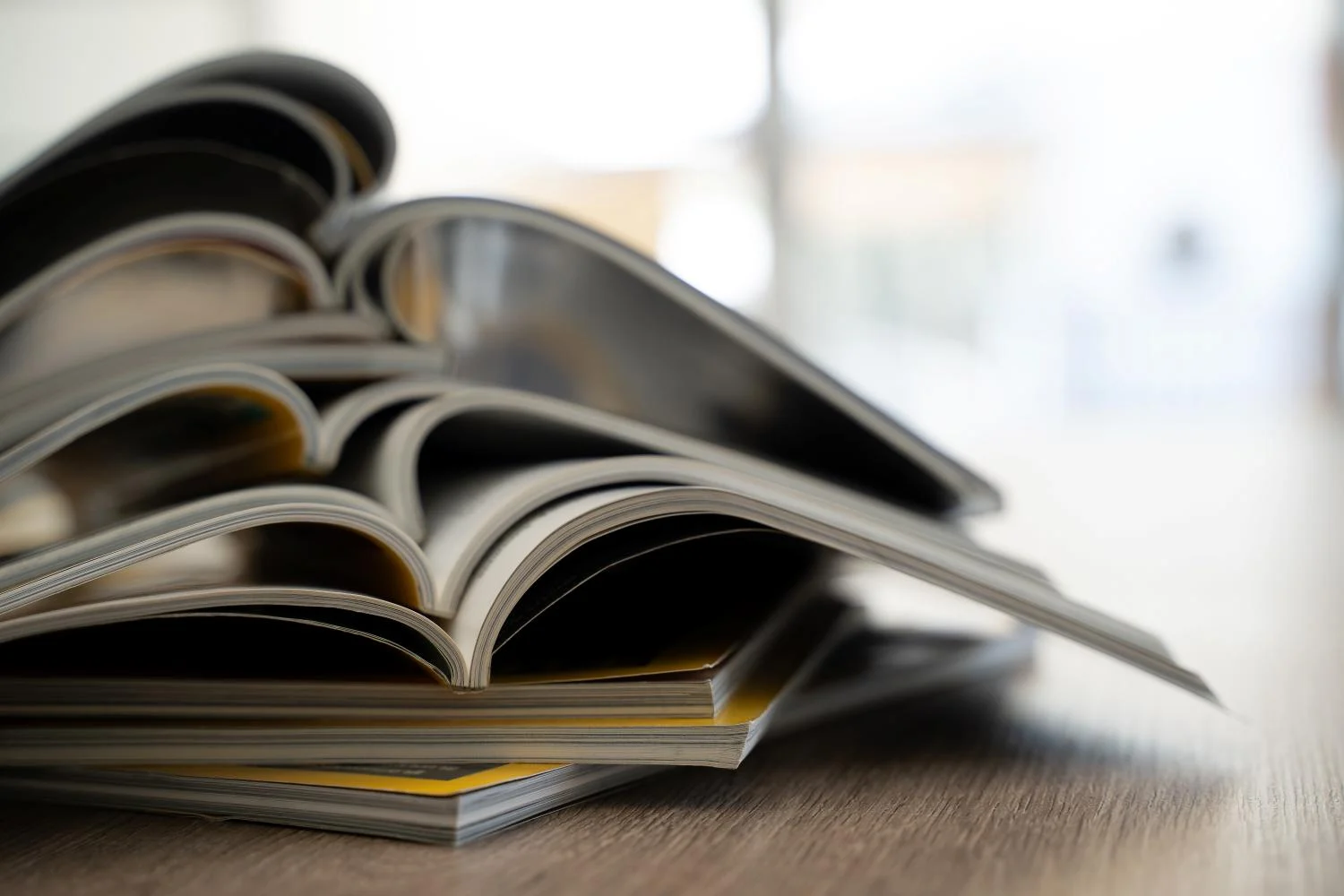
Saddle Stitching for Slim, High-Impact Pieces
Saddle stitching is ideal when the catalog is relatively slim and you want a clean, magazine-like experience. Pages are folded, nested and stitched through the spine fold, which typically creates excellent openability for quick browsing. Saddle stitch also generally comes with faster turnaround, which can make it attractive for shorter lead times.
The trade-off is perception and real estate. Saddle-stitched pieces do not have a printable square spine, so they do not present like a book on a shelf. As page count increases, the booklet can also “creep,” meaning inner pages push outward and require precise trim planning to keep margins consistent. For luxury applications, saddle stitch can still feel premium when paired with a heavier cover, refined coatings and tight trim control, but it tends to shine best as a thinner, high-frequency piece rather than a long-life reference catalog.
Perfect Binding for a Premium, Book-Like Presentation
Perfect binding is the go-to choice when you want a square spine and a more elevated look. Pages are gathered into a block and adhered into a wraparound cover, producing the flat spine that luxury brands often prefer.
For high-end catalogs, perfect binding is valued for its clean, book-like appearance and strong shelf presence. It creates a flat, printable spine and a polished look that works well for thicker catalogs. Because pages are held together at the spine, careful planning helps the book open comfortably and hold up to repeated use. Designs should also allow extra space near the gutter so images and important details remain easy to see when the catalog is open.
Sewn Binding for Longevity and Elevated Craft
If the catalog is meant to become a keepsake, sewn binding is worth serious consideration. Sewing signatures creates a durable book block that typically holds up better over repeated use and can offer a more confident opening behavior than adhesive-only approaches. Sewn constructions are common in premium books, high-value guides and catalogs that strive to feel archival rather than seasonal.
Sewn binding can also elevate the tactile experience. Page turns often feel smoother, the structure more refined and the binding can better withstand heavier text weights. The trade-offs are usually cost, production complexity and schedule. If the catalog is part of a flagship brand moment or commemorative release, those trade-offs can be justified by the increased perceived value and lifespan.
Lay-Flat Needs Change the Conversation
Luxury catalogs often depend on photography, and photography often depends on spreads. If your layouts rely on crossover images, you should think early about how flat the catalog needs to open. Many bound books open “mostly flat” with good design discipline, but true lay-flat performance is a different expectation.
A strong lay-flat plan can influence everything: gutter allowances, image composition, text placement and even how you design product stories. If the catalog’s value is in immersive visuals, prioritizing ease of use can protect that investment. If the value is in shelf presence and navigation, a square spine may matter more. The best solution is the one that matches how readers will actually use the piece.
Mechanical Binding for Function-First Luxury
Spiral, Wire-O and other mechanical bindings are sometimes overlooked in luxury applications, but they can be perfect when function is the premium feature. Think reference catalogs, technical product collections, training guides or swatch-driven materials that must stay open on a table. Mechanical bindings typically excel at openability and repeated handling.
The trade-off is aesthetics and design flexibility. Many mechanical bindings do not support crossover spreads the way stitched or perfect-bound catalogs do, and they often require different file setup and margin planning. If your catalog is meant to feel like a refined tool rather than a coffee-table piece, mechanical binding can be a smart choice, especially when paired with premium paper, thoughtful cover materials and elevated finishing.
Finishing and Coatings Must Support the Binding
Luxury catalogs lean heavily on coatings and finishes, but finishes can also introduce binding risks if they are not planned in context. Heavy coverage on a spine can crack if the cover is not properly scored or if grain direction is working against the fold. Gloss and matte films can change flexibility. Spot treatments near folds may require extra care so the finish looks crisp when the catalog is opened.
The best approach is to treat binding and finishing as a single system. When cover stock, lamination, scoring and binding methods are aligned, the catalog opens smoothly and the finish looks intentional rather than stressed.
A Simple Way to Choose With Confidence
If you want a practical decision framework, start here:
- How thick is the catalog in the chosen paper?
- Does it need a printable spine for shelf presence?
- How flat must it open to support your photography and layout style?
- How long must it last in the reader’s hands?
- Will it be primarily mailed, handed out or displayed?
Answering those questions early helps you avoid late-stage pivots. It also makes it easier for your print partner to recommend paper, coatings and pre-press adjustments that support the binding method you select.
Explore Walsworth’s Catalog Binding Options
If you’re weighing binding options for a luxury catalog and want guidance grounded in real production outcomes, Walsworth’s experts can offer guidance on the trade-offs between common methods and how they affect durability and design, helping you make an informed decision that aligns with your brand image. Ready to learn more? Get in touch with us today.
This article was developed with assistance from OpenAI’s GPT 5.2 Pro Deep Research large language AI model.