In photo-driven coffee table books, paper is not a background decision. It is part of the image system itself. Surface, shade, opacity and weight all change how ink sits on the sheet and how light returns to the eye. That means the same photograph can look vivid and crisp on one stock, then softer or flatter on another.
If you are planning a project, it is helpful to understand what to consider when printing coffee table books before narrowing down paper options.
Start With the Visual Goal
The first question is not “Which paper is best?” It is “What should the photography feel like?” If the book depends on fine detail, rich blacks and clean gradients, a coated sheet will usually give you the most predictable result. Coated papers hold ink closer to the surface, which helps preserve contrast and detail.
If the goal is more editorial or atmospheric, uncoated papers can be compelling. They absorb more ink and create a softer, more tactile feel. This is often used in books where storytelling and tone matter just as much as image sharpness. The key is aligning the paper choice with the intent of the project.
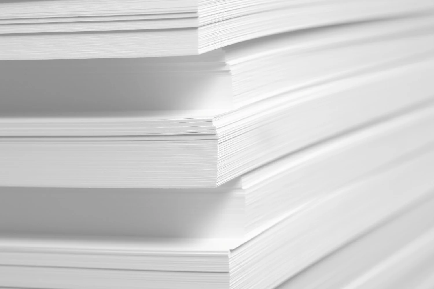
Understanding Common Paper Weights
For image-heavy coffee table books, weight plays an important role in both perceived quality and performance. A good starting point is 60# text weight or higher, which helps prevent show-through and adds substance to each page.
Many premium projects move into the following ranges:
- 80# text for a balanced feel and solid opacity
- 100# text for a heavier, more substantial page
- Higher weights when maximum opacity and thickness are required
Keep in mind that heavier paper improves durability and reduces show-through, but it also increases printing, shipping and binding costs. That is why weight selection should be considered alongside page count, trim size and distribution plans. Take a look at this paper weight conversion guide to see how paper weight is measured and what it means.
Coated, Uncoated and the Finishes in Between
One of the most important decisions is whether to choose coated or uncoated paper.
Coated paper is typically preferred for high-end photo reproduction because it enhances color vibrancy and detail. Different finishes offer different benefits:
Gloss coating
- Maximum color saturation and contrast
- Ideal for bold, high-impact photography
- Can introduce glare under certain lighting
Matte coating
- Reduced glare with a refined appearance
- Strong balance between readability and image quality
- Often used for premium coffee table books
Silk or satin coating
- Subtle sheen with excellent image reproduction
- A versatile choice for many luxury projects
Uncoated paper, by contrast, creates a more natural feel. Uncoated paper is typically not recommended for photo-heavy books where quality and color are important. It is often used for editorial-style books or text-heavy books, and for brands that want a softer, more tactile experience.
Paper Shade, Brightness and Why White Is Never Neutral
Even subtle differences in paper shade can significantly affect how images appear. Paper acts as the base “white” of every printed image, so its brightness and tone influence color reproduction.
Brighter, cooler sheets
- Enhance contrast and clarity
- Make colors feel more modern and crisp
Warmer sheets
- Soften images and create a more natural feel
- Enhance earthy tones and skin tones
Because of this, it is important to review printed samples using your actual photography. Color decisions that look correct on screen may look drastically different on your chosen paper.
Opacity, Detail and the Cost of Going Too Light
Opacity matters more than many buyers expect. When paper is too thin, images from the reverse side of a page can show through, reducing clarity and contrast.
For photo-heavy books, higher opacity helps:
- Maintain clean highlights and neutral tones
- Preserve shadow detail
- Improve overall visual consistency across spreads
Choosing slightly heavier stock is often the simplest way to improve opacity without redesigning layouts.
Image quality itself is equally important. According to Adobe’s print resolution guidelines, 300 pixels per inch is the standard for high-quality prints viewed up close. This is especially relevant for coffee table books, where readers closely examine images.
The Best Paper Choice Fits the Photography
There is no single “luxury” paper. The right choice depends on the relationship between the images, the brand and the intended experience.
If your project prioritizes detail and color accuracy, start with coated stocks and compare finishes using your own photography. If the goal is warmth and tactility, test premium uncoated options and understand the trade-offs.
The most effective approach is to:
- Align paper with the visual intent of the book
- Test real images, not just swatches
- Balance weight, finish and cost against the final use
How Walsworth Supports High-End Book Publishers
At Walsworth, we work with publishers and brands to evaluate their printing needs together. From paper selection to color management, we help ensure your images reproduce as intended while keeping your project aligned with budget and production goals.
If you are planning a project, you can explore our guide on accurate color printing to better understand how paper and pre-press work together. Or if you’d like to learn more, get in touch with us today to start the conversation.
* This article was developed with assistance from OpenAI’s GPT 5.5 large language AI model.