Children’s publishers compete on story and illustration, but the first purchase decision often happens before a single page is read. A cover that catches light, feels premium and stays beautiful after repeated handling can be the difference between being picked up or passed over. That is where specialty finishing matters.
For children’s book publishers, specialty coatings are not just decorative upgrades. They are tools that influence perception, engagement and durability. Below is a practical, publisher-focused look at how specialty coatings help children’s books stand out, when each finish makes sense and how to incorporate them without surprises.
Why Specialty Finishing Matters in Children’s Publishing
Children’s books are often handled more aggressively than most print products. They are carried, stacked, dropped and read repeatedly. A premium finish helps in three ways: it increases shelf appeal, it creates a tactile experience that invites interaction while protecting the cover from scuffs, rub and fingerprints.
The Three Benefits That Matter Most
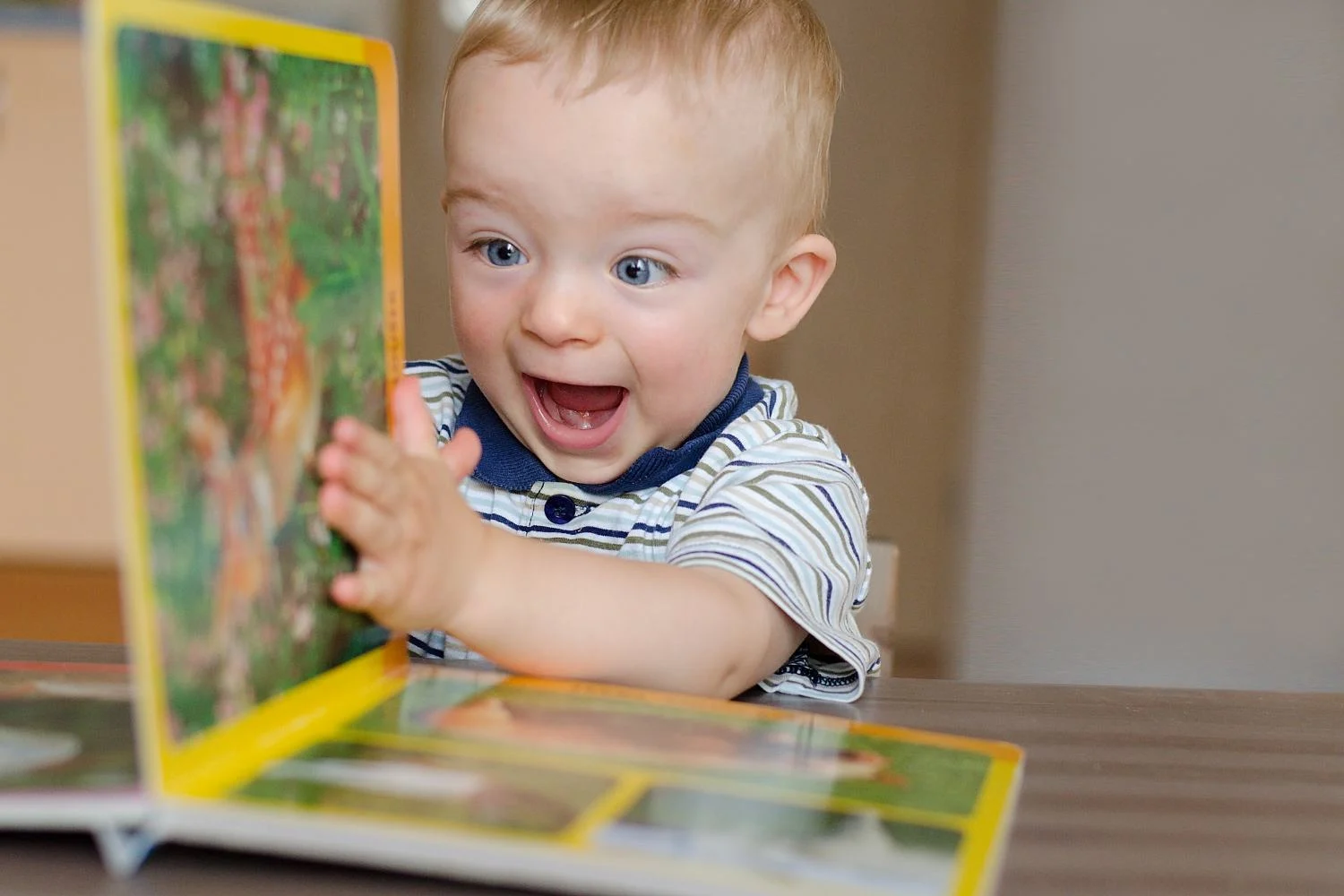
Visual Impact That Sells the Book
Gloss and matte choices influence how illustration appears. Coated paper yields more intense colors and crisper detail because ink sits on top of the coating rather than soaking in, which helps illustrated covers look crisp and saturated.
Tactile Cues That Increase Pickup and Dwell
A child or parent does not evaluate a cover like a spec sheet. They respond to feel. Soft-touch finishes deliver a velvety feel that signals premium quality and encourages readers to pick up the piece. Spot UV can be paired with a matte background to create contrast that invites touch, which makes it useful for titles competing on crowded shelves.
Durability That Protects Brand Perception
Damage is not only a physical problem. It is a quality signal. Protective UV and protective laminations are options that defend covers against rub, improve durability and elevate perceived value. For publishers, that means fewer scuffed covers in transit, better-looking books in stores and a stronger impression after multiple reads.
Coatings and Laminations That Deliver Results
Specialty finishing can be grouped into two broad categories: coatings applied to the printed surface and laminations that add a film layer. Common coating options include spot and flood UV, varnish, raised UV, aqueous and lamination of many types. The right choice depends on the role the finish needs to play.
Aqueous Coatings: Practical Protection With a Clean Look
Aqueous coatings are water based and generally cost effective. Gloss aqueous boosts image contrast on photo heavy pages and resisting fingerprints, while matte aqueous lowers glare for text heavy sections and lends a refined feel.
For children’s books, that translates to two common wins:
- Gloss aqueous can make color-driven covers feel brighter and more energetic.
- Matte aqueous can make typography-heavy covers easier to read under harsh lighting and reduce glare in photos.
Spot UV and Raised UV: Direct Attention Where It Counts
Spot UV is a proven way to highlight a logo or headline. For children’s books, it also works well for:
- Title treatments that need to pop from a distance
- Character art that you want kids to “find” by touch
- Series branding so multiple titles look cohesive on a shelf
Raised UV another option that can add texture without changing the core cover substrate. Raised effects can help a cover feel interactive while keeping the rest of the design clean and readable.
Soft-Touch Lamination: Premium Feel With Real-World Benefits
Soft touch delivers a subtle velvety feel that signals quality. In children’s publishing, it can be a good fit for giftable picture books, hardcover case wraps and premium series where the tactile cue supports a higher perceived value. When a cover feels distinctive, it is more likely to be picked up again, which helps the title earn time and attention.
Gloss and Matte Lamination: When You Need Maximum Defense
Protective laminations are positioned as a way to defend covers against rub and improve durability. Gloss lamination adds snap to photography, while matte controls glare on text-heavy covers. For children’s books that will be stocked in classrooms, libraries or high-traffic retail, lamination is often the best option when the priority is keeping the cover looking clean after heavy handling.
How To Choose the Right Finish for the Title
A useful way to choose between many options is to tie the finish to the job the book must do.
If the Book Must Win on a Crowded Shelf:
Start with a clean base finish, then add one focal effect. We recommend choosing one primary effect to keep the design focused. A common combination is a soft-touch or matte base with spot UV on the title or a key illustration element.
If the Book Must Hold Up to Heavy Use:
Prioritize protection first, then add tactile value where it supports the design. Protective UV and laminations defend covers against rub and improve durability in distribution. Pair that with simple spot accents for increased shelf appeal.
If the Book Is Illustration-Driven:
Coated surfaces help keep ink sharp and detailed, which supports fine line art and saturated color. Gloss can make color feel more vibrant, while matte can feel more refined and glare-free depending on the art style.
File Setup: A Small Step That Prevents Big Problems
Spot coatings are powerful, but only when the files are built correctly. Specific steps should be taken during spot UV file setup, including creating a separate spot UV file that is black and white only, where black elements receive UV. Use layers in your design software to support accurate registration between cover artwork and the spot UV layer. Walsworth has created quick start guides that cover how to create a spot varnish or spot UV swatch in InDesign.
How Walsworth Supports Specialty Finishing for Children’s Books
Walsworth offers finishing options as both visual enhancement and durability support, including foil stamping and embossing, soft-touch, gloss and matte coatings plus spot UV and specialty finishes. If you are choosing specialty finishing for a children’s title, it’s important to identify the goal: shelf impact, tactile experience, durability or a combination. Strategic finishing options will help your project meet your goals while staying within your timeline and budget.
As a specialty book printer, we pride ourselves on offering countless combinations of printing, binding and finishing options to meet the unique needs of children’s publishers. If you’d like to learn more about what Walsworth has to offer, just get in touch with us today.
* This article was developed with assistance from OpenAI’s GPT 5.5 large language AI model.